デザイン書道名鑑について
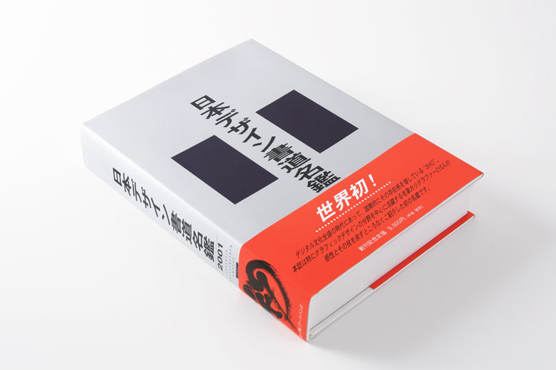
日本デザイン書道名鑑2001
2000年、グラフィックデザインの分野を中心に活躍する毛筆カリグラファー215人の感性とその技を余すところなく紹介した名鑑、『日本デザイン書道名鑑』(日・英バイリンガル仕様)を発行。
企画・編集・発行・発売:株式会社アートバンク
協力:日本商業書道作家協会
ISBN:4-901246-01-1
発行年月:2000年9月25日
頁数:540
印刷・製本:関西美術印刷株式会社
※現在販売終了
デザイン書道の歩みと今後
桑山弥三郎
(『デザイン書道名鑑2001』序文より)
デザイン書道とはデザインの要素として毛筆体を取り入れることやロゴタイプの表現を毛筆で表すことなど書道にデザイン意識が加わったものを言う。複製されるためにサイズの変化に耐え、墨から色になったり多くの制約を受ける。それは書道といっても観賞だけでなく使用目的が明確で優先され、その内容を表現する線やかすれや字体が求められる。さらに美しく、読みやすく、印象が強いもの。その上に強さや、親しみ、優しさ、さわやかさなどがつけ加えられることもある。
デザイン書道という言葉は新しいが、その意味する実体は古くからあった。それは毛筆が日常の筆記用具であった時代から始まる。文字による意味伝達に加えて字形に何かを語らせる。すなわち何かのイメージをもたせるように意識して書くもの、他のものと区別し、独自性を持つ字形。これが物品に貼られる紙に書かれればそれは商標になる。鎌倉、室町時代にはこれらの書は商標の機能を持つようになった。一般に普及したのは商標が法的に保護を受けるために登録された明治17 年(1884) 頃であろう。
文化面からみると江戸時代はデザイン書道の活躍した興味ある時代であった。その源は筆記書体の「お家流」から出発している。お家流は書道の芸術性より実用性に重きがおかれ、寺子屋の文字を教える書体として江戸幕府の公認となる。このお家流を芝居の看板にふさわしい書体に工夫したものが「勘亭流」の誕生である。それは安永8 年(1779)中村座のまねき看板で岡崎屋勘六によって創作された。この書体は芝居文化と結びつき、芝居の雰囲気を盛り上げ、内容を表すことを意識したデザイン書道の先駆者になった。勘亭流から影響を受けて火消しまといの「篭字」、寄席の「ビラ文字」、酒銘柄の「ひげ文字」などが誕生した。これらを総して江戸文字と呼ぶ。
現代のロゴタイプやタイプフェイスなどデザイン文字は法的保護がない。苦心し時間をかけて制作した作品がコピーされたり、まねされたりした事件が後をたたない。その中にあってデザイン書道は「書」としての芸術の範疇にあるので現在の著作権で保護される。現在は毛筆スタイル文字だけが保護の対象になり他のデザイン文字は対象外とされている。これからは書とデザインの中間のものや組み合わせたものが出現したときにどのように考えるかという問題が残る。
デザイン書道の今後の発展を考えてみる。本書は北海道から沖縄までの全国の作家作品が集録できた。一見して作家の特徴や書風が判り、作品依頼者にとっては作家の個性と力量を知ると共に狙いの書き手を探す案内書になる。今後は中国や台湾などの書道の国を含めた国際版として発表できるだろう。今回タイプフェイスは一点だけであったが、この分野にも進出するなら、一商品や一催物タイトルだけでなく組み文字することによって無限に作品を産みだすことができる。
またマークやピクトグラムの世界にもデザイン書道を生かせるだろう。書の文字を一部カットしたり、デザイン文字と組み合わせたり、イラストと組み合わせることにより、分野を広げ新しいものを作りだせる可能性がある。本書がその契機になれば出版の意義はさらに大きなものになる。
桑山弥三郎 Yasaburo KUWAYAMA
1938 年 新潟県柏崎市に生まれる。阿佐ヶ谷美術学園でデザインを学ぶ。
1960 年武蔵野美術短期大学卒業。1969 年桑山書体デザイン室設立。
主著には、「レタリングデザイン」(1969: グラフィック社)、「ロゴデザイン」(1994: 柏書房)、「マークの風景」(2001: 桑山書体デザイン室) がある。2017 年1月逝去。
Designed Calligraphy – Past, Present, and Future
Yasaburo KUWAYAMA
Designed calligraphy involves adding a taste of design to calligraphy by employing brush script fonts in design or presenting logotypes in calligraphy. It withstands the change of size even though it gets copied but is under certain restrictions as it uses not only ink but color. With prioritized clear purpose for use, designed calligraphy calls for lines distinct and hazy to express the content. We look for that which is more beautiful, legible, and impressive. Moreover, strength, approachability, kindness, and freshness may be needed.
The term, “designed calligraphy” is new. Yet, what it represents has long been in existence. It dates back to the time when writing brushes were used in everyday life. Not only letters, but letter styles had a part in communication. Namely, by utilizing a unique set of font, a certain image was reflected and established. When written on labels, it became a trademark. In the Kamakura and Muromachi periods, fonts came to serve as trademarks. This became popular in the 17the year of Meiji period (1884 C.E.), when certain fonts were registered to be legally protected as trademarks.
From the standpoint of culture, the Edo period is of interest as it saw designed calligraphy flourish. It started from the handwriting style, “O-ie-ryu.” It put more emphasis on practicality than artistry of calligraphy and was officially approved by the Tokugawa Shoguanate as the font to be taught at literacy schools. With some adjustment, it generated Kantei-ryu, which was used in banners at theaters. This was created by Okazakiya Kanroku for banners at the Nakamura Theatre in the 8th year of Anei period (1779 C.E.). This font became closely related to the theater culture and gave plays a good deal of boost. Thus, he spearheaded designed calligraphy in expressing the content. With the influence of Kantei-ryu, various fonts were created such as Kagoji for fire fighters and Hige-moji for Japanese sake labels. These are referred to as Edo fonts.
In modern times, there is no legal protection over designed letters such as logotypes and typefaces. Products of hours of work have been duplicated and copycatted time and again. Yet, designed calligraphy is under the protection of current copyright laws as it is in the sphere of calligraphic art. To date, calligraphic letters, excluding other designed letters, are under protection. There remains a problem as to how we will deal with [1] fonts that are in-between calligraphy and design and [2] those calligraphy and design combined when they ever come to the scene.
How will designed calligraphy develop in the future? This annual contains artists and their works from all over Japan. With just a glance, you can get to see their characteristics and styles. The annual will be a good reference for artists. For potential clients, it will be a guidebook that enables them to know the identity and skill of the artists and to locate them. An international version may be expected in the future to cover lands of calligraphy, such as China and Taiwan. This time, the annual contains just one typeface. Yet, if this field is covered in the annual, you could produce an unlimited number of works by combining letters from different pieces and banners. Further, designed calligraphy may be used in the worlds of marks and pictographs. By cutting a part of letters, combining designed letters, or pasting with illustrations, you could expand the field and produce something totally new. Publishing this annual may prove to be a milestone when it indeed heralds a new era.
(Translator : Eisuke “Ace”Kawano)